SDK language and UI customization
Start here
The Onfido SDKs have multiple customizable features that provide flexibility, while also being easy to integrate. Customizing the Onfido SDKs to match the look and feel of your application can help improve your user experience.
This guide provides an overview of the customization options available with the Onfido SDKs. This includes:
- language localization
- UI customization
For general technical documentation relating to our SDKs, follow the links on our main Developer Hub page.
Language localization
The Onfido SDKs allow for language customization across all platforms.
Supported languages
Onfido supports and maintains translations for 44 languages that can be implemented directly inside the SDK.
All of these languages are supported across Android, iOS and Web, under the following locales:
| Language | Android | iOS | Web |
|---|---|---|---|
| Arabic (ar) | ✔ | ✔ | ✔ |
| Armenian (hy) | ✔ | ✔ | ✔ |
| Bulgarian (bg) | ✔ | ✔ | ✔ |
Chinese (Simplified) (zh_CN for Android and Web, zh_Hans for iOS) |
✔ | ✔ | ✔ |
Chinese (Traditional) (zh_TW for Android and Web, zh_Hant for iOS) |
✔ | ✔ | ✔ |
| Croatian (hr) | ✔ | ✔ | ✔ |
| Czech (cs) | ✔ | ✔ | ✔ |
| Danish (da) | ✔ | ✔ | ✔ |
| Dutch (nl) | ✔ | ✔ | ✔ |
English (United Kingdom) (en_GB) |
✔ | ✔ | ✔ |
English (United States) (en_US) |
✔ | ✔ | ✔ |
| Estonian (et) | ✔ | ✔ | ✔ |
| Finnish (fi) | ✔ | ✔ | ✔ |
| French (fr) | ✔ | ✔ | ✔ |
French (Canadian) (fr_CA) |
✔ | ✔ | ✔ |
| German (de) | ✔ | ✔ | ✔ |
| Greek (el) | ✔ | ✔ | ✔ |
| Hebrew (he) | ✔ | ✔ | ✔ |
| Hindi (hi) | ✔ | ✔ | ✔ |
| Hungarian (hu) | ✔ | ✔ | ✔ |
| Indonesian (id) | ✔ | ✔ | ✔ |
| Italian (it) | ✔ | ✔ | ✔ |
| Japanese (ja) | ✔ | ✔ | ✔ |
| Korean (ko) | ✔ | ✔ | ✔ |
| Latvian (lv) | ✔ | ✔ | ✔ |
| Lithuanian (lt) | ✔ | ✔ | ✔ |
| Malay (ms) | ✔ | ✔ | ✔ |
| Norwegian (nb) | ✔ | ✔ | ✔ |
| Persian (fa) | ✔ | ✔ | ✔ |
| Polish (pl) | ✔ | ✔ | ✔ |
| Portuguese (pt) | ✔ | ✔ | ✔ |
Portuguese (Brazil) (pt_BR) |
✔ | ✔ | ✔ |
| Romanian (ro) | ✔ | ✔ | ✔ |
| Russian (ru) | ✔ | ✔ | ✔ |
Serbian (sr_Latn for Android and iOS, sr for Web) |
✔ | ✔ | ✔ |
| Slovak (sk) | ✔ | ✔ | ✔ |
| Slovenian (sl) | ✔ | ✔ | ✔ |
| Spanish (es) | ✔ | ✔ | ✔ |
Spanish (Latin America) (es_419) |
✔ | ✔ | ✔ |
| Swedish (sv) | ✔ | ✔ | ✔ |
| Thai (th) | ✔ | ✔ | ✔ |
| Turkish (tr) | ✔ | ✔ | ✔ |
| Ukrainian (uk) | ✔ | ✔ | ✔ |
| Vietnamese (vi) | ✔ | ✔ | ✔ |
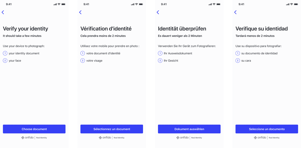
The screenshots above offer an illustration of several language localizations.
Each SDK platform has its own method of language localization. Further information can be found in our SDK reference documentation for iOS, Android and Web.
If no language is selected, the SDK will detect and use the end user's browser or device language setting. If the browser/device language is not supported, the SDK will default to English (en_US).
Custom language
The Onfido SDKs also allow for the selection of a specific custom language for locales that Onfido does not currently support.
You need to provide custom translations and the relevant locale tag.
Note: If a locale is not specified, the language is inferred from the device/browser settings.
Further information can be found in our SDK reference documentation for iOS, Android and Web.
UI customization
The Onfido SDKs include a range of UI options that allow you to customize the look and feel of the SDKs to match your application (such as fonts, button colors, icon colors and text colors). This helps create a more seamless experience for your users. The available features are documented below.
Styling attributes
iOS
To customize the look and feel of the iOS SDK, you can pass the required CSS values to the Appearance object, in the root of the WorkflowConfiguration object. For specific implementation details, please refer to our SDK reference documentation.
The iOS SDK supports the following styling features:
-
Colors
primaryColor: Defines the button color and back navigation button colorprimaryTitleColor: Defines the primary button text colorsecondaryTitleColor: Defines the secondary button text and border colorprimaryBackgroundPressedColor: Defines the primary button pressed state colorsecondaryBackgroundPressedColor: Defines the secondary button pressed state color-
backgroundColor: Defines the screen's background color for non-capture viewslight: Defines the backgroundColor in light modedark: Defines the backgroundColor in dark mode
-
captureSuccessColors: Defines the color values for the capture screen success auto capture stateborderColor: Defines the border color of the area of interest in capture screentickViewImageTintColor: Defines the tick icon's tint color shown in capture screen after auto capture happenstickViewBackgroundColor: Defines the tick icon's background color shown in capture screen after auto capture happens
-
Interface
borderCornerRadius: Defines border corner radius for all the buttons (default 5.0)-
interfaceStyle: Defines the interface style- Note: This property is applicable only for Xcode 11 and above built apps and devices running on iOS 13 and above
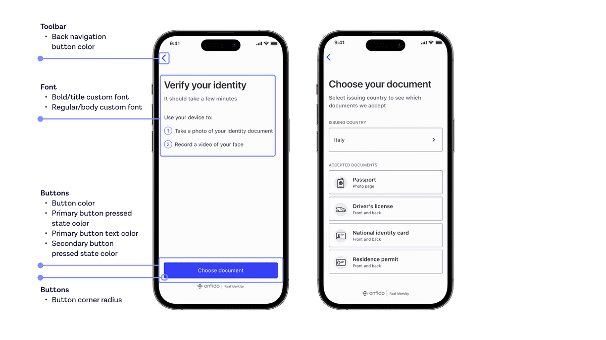 The screenshots above illustrate some of the customization options available for iOS
Android
In the Android SDK, you can customize colors and other appearance attributes by overriding Onfido themes (OnfidoActivityTheme and OnfidoDarkTheme) in your themes.xml or styles.xml files. For specific implementation details, please refer to our SDK reference documentation.
When customizing fonts, all referenced fonts must be added to your project first. Further instructions for adding fonts can be found in the Android documentation.
The Android SDK supports the following styling features:
-
Colors
-
General
onfidoColorBackground: Background color of the non-capture screenscolorAccent: Defines alert dialogs' accent color, and text input fields' focused underline, cursor, and floating label color
-
Content
onfidoColorContentMain: Color of primary texts on screen, e.g. titles and regular body textsonfidoColorContentMainDark: Color of the content on capture screens (those with dark backgrounds)onfidoColorContentSecondary: Color of secondary texts on screen, e.g. subtitlesonfidoColorContentNegative: Color of error texts
-
Main buttons
onfidoColorActionMain: Background color of primary buttonsonfidoColorActionMainPressed: Background color of primary buttons when pressedonfidoColorActionMainDisabled: Background color of primary buttons when disabledonfidoColorContentOnAction: Text color of primary buttonsonfidoColorContentOnActionDisabled: Text color of primary buttons when disabled
-
Secondary buttons
onfidoColorActionSecondary: Background color of secondary buttonsonfidoColorActionSecondaryPressed: Background color of secondary buttons when pressedonfidoColorActionSecondaryDisabled: Background color of secondary buttons when disabledonfidoColorContentOnActionSecondary: Text color of secondary buttonsonfidoColorContentOnActionSecondaryDisabled: Text color of secondary buttons when disabledonfidoColorActionSecondaryBorder: Border of the secondary buttonsonfidoColorActionSecondaryBorderDisabled: Border of the secondary buttons when disabled
-
Disclaimers
onfidoColorDisclaimerBackground: Background color of disclaimer boxesonfidoColorContentDisclaimer: Text color of disclaimer boxesonfidoColorIconDisclaimer: Icon color of disclaimer boxes
-
Toolbar and status bar
onfidoColorToolbarBackground: Background color of theToolbarwhich guides the user through the flowcolorPrimaryDark: Color of the status bar (with system icons) above theToolbaronfidoColorContentToolbarTitle: Color of theToolbar's title text
-
Icons
onfidoColorIconStroke: Stroke color of iconsonfidoColorIconStrokeNegative: Stroke color of error iconsonfidoColorIconFill: Fill color of iconsonfidoColorIconBackground: Background color of iconsonfidoColorIconAccent: Background color of accented iconsonfidoColorWatermark: Color of the Onfido logo and co-brand logo in the footer of non-capture screensonfidoColorWatermarkDark: Color of the Onfido logo and co-brand logo in the footer of capture screens
-
Spinner / progress indicator
onfidoColorProgressTrack: Track color of progress indicators (background color)onfidoColorProgressIndicator: Indicator color of progress indicators (foreground color)
-
-
Widgets
-
You can customize the appearance of some widgets in your
dimens.xmlfile by overriding:onfidoButtonCornerRadius: Defines the radius dimension of all the corners of primary and secondary buttons
-
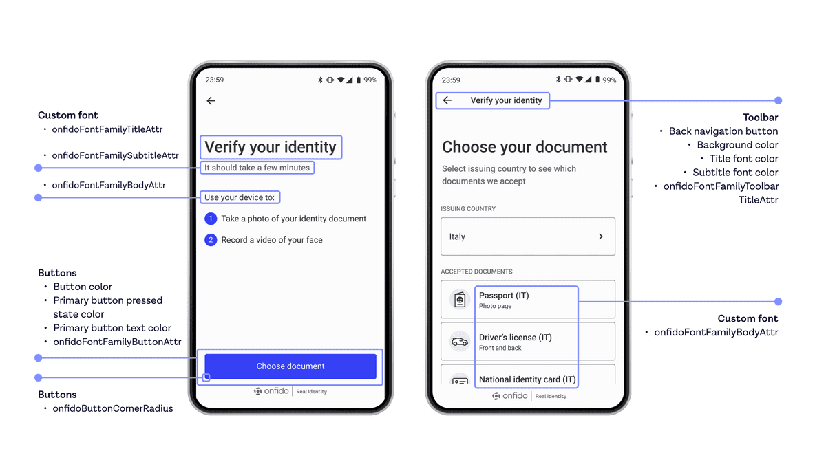 The screenshots above illustrate some of the customization options available for Android
Web
To customize the appearance of the Web SDK, you can pass the corresponding CSS values to the customUI object.
customUI {Object}optional
For specific implementation details, please refer to our SDK reference documentation.
The Web SDK supports the following styling features:
Main container options
colorBackgroundSurfaceModal: Change background color of SDK modalcolorBorderSurfaceModal: Change color of SDK modal borderborderWidthSurfaceModal: Change border width of SDK modalborderStyleSurfaceModal: Change border style of SDK modalborderRadiusSurfaceModal: Change border radius of SDK modalcolorContentTitle: Change text color of the SDK screen titlescolorContentSubtitle: Change text color of the SDK screen subtitlescolorContentBody: Change text color of the SDK screen content
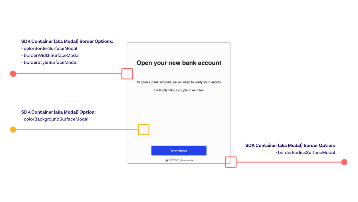 The screenshot above offers an illustration of some of the container customizations available for Web.
Button customization options
-
Primary buttons
colorContentButtonPrimaryText: Change color of Primary Button textcolorBackgroundButtonPrimary: Change background color of Primary ButtoncolorBackgroundButtonPrimaryHover: Change background color of Primary Button on hovercolorBackgroundButtonPrimaryActive: Change background color of Primary Button on click/tapcolorBorderButtonPrimary: Change color of Primary Button bordercolorBorderButtonPrimaryHover: Change color of Primary Button border on hovercolorBorderButtonPrimaryActive: Change color of Primary Button border on click/tap
-
Secondary buttons
colorContentButtonSecondaryText: Change color of Secondary Button textcolorBackgroundButtonSecondary: Change background color of Secondary ButtoncolorBackgroundButtonSecondaryHover: Change background color of Secondary Button on hovercolorBackgroundButtonSecondaryActive: Change background color of Secondary Button on click/tapcolorBorderButtonSecondary: Change color of Secondary Button bordercolorBorderButtonSecondaryHover: Change color of Secondary Button border on hovercolorBorderButtonSecondaryActive: Change color of Secondary Button border on click/tap
-
Document type buttons
colorContentDocTypeButton: Change Document Type Button text colorcolorBackgroundDocTypeButton: Change background color of Document Type ButtoncolorBackgroundDocTypeButtonHover: Change background color of Document Type Button on hovercolorBackgroundDocTypeButtonActive: Change background color of Document Type Button on click/tapcolorBorderDocTypeButton: Change color of Document Type Button bordercolorBorderDocTypeButtonHover: Change color of Document Type Button border on hovercolorBorderDocTypeButtonActive: Change color of Document Type Button border on click/tap
-
Shared buttons
borderRadiusButton(string): Change border radius value of Primary, Secondary and Document Type Option buttonsbuttonGroupStacked(boolean, default:false): Display Primary, Secondary button group in Document and Face capture confirmation screens are in separate rows instead of inline by default
-
Icon buttons
colorBackgroundButtonIconHover: Change background color of Back, Close Modal icon buttons on hovercolorBackgroundButtonIconActive: Change background color of Back, Close Modal icon buttons on click/tap
-
Camera shutter button
colorBackgroundButtonCameraHover: Change background color of Live Selfie/Document Capture screens's Camera button on hovercolorBackgroundButtonCameraActive: Change background color of Live Selfie/Document Capture screen's Camera button on click/tap
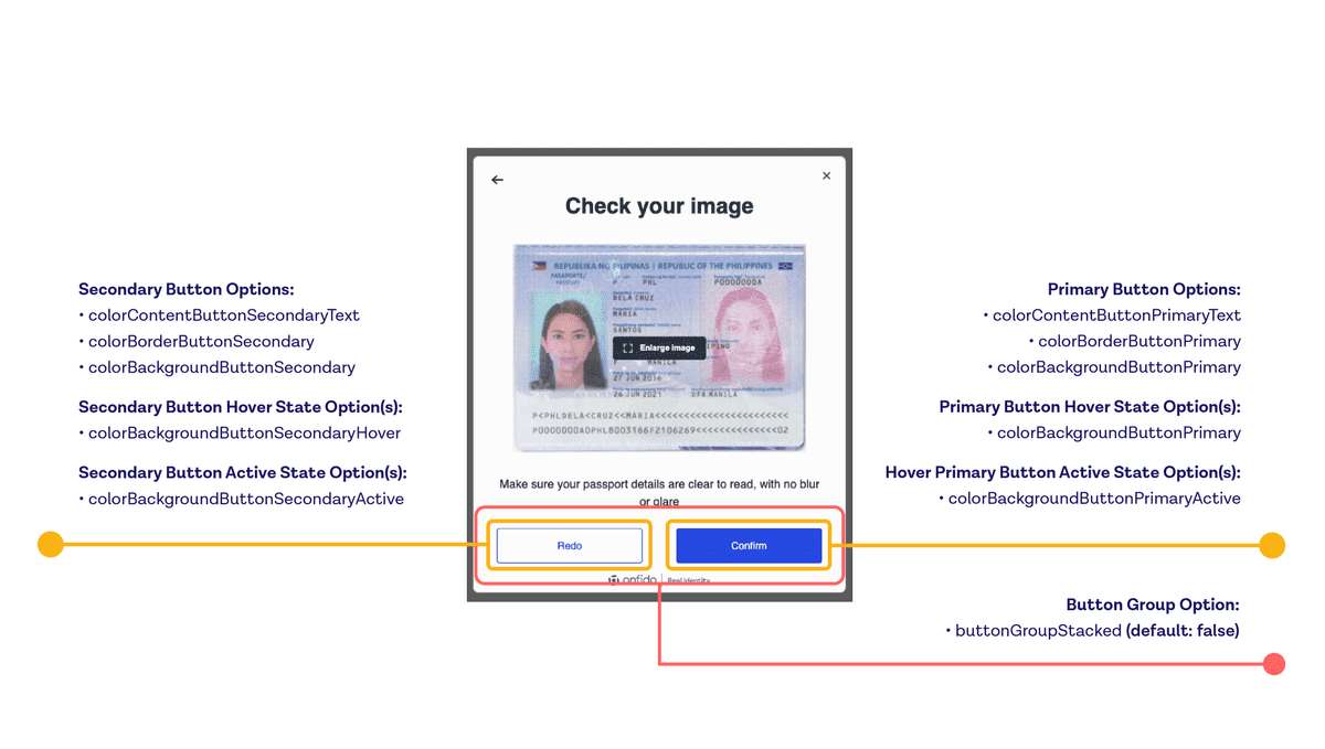 The screenshot above offers an illustration of some of the button customizations available for Web.
Selector options
colorBackgroundSelector: Change Selector background color
Icon options
colorBackgroundIcon: Change color of the background circle of pictogram icons in the SDKcolorIcon: Change color of the colored (blue) small iconscolorInputOutline: Change color of outline around certain input fields
Link options
colorContentLinkTextHover: Change Link text color on hovercolorBorderLinkUnderline: Change Link underline colorcolorBackgroundLinkHover: Change Link background color on hovercolorBackgroundLinkActive: Change Link background color on click/tap
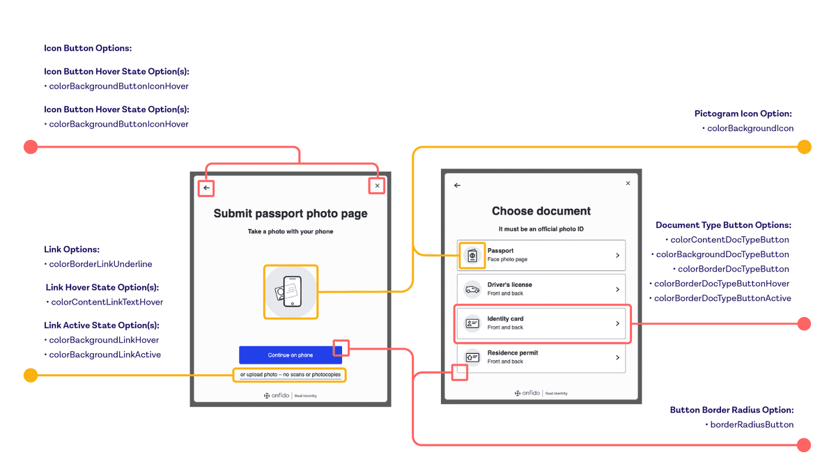 The screenshot above offers an illustration of the link and icon customizations available for Web.
Warning popup options
colorContentAlertInfo: Change warning popup text colorcolorBackgroundAlertInfo: Change warning popup background colorcolorBackgroundAlertInfoLinkHover: Change warning popup fallback Link background on hovercolorBackgroundAlertInfoLinkActive: Change warning popup fallback Link background on click/tap
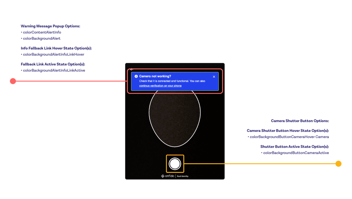 The screenshot above offers an illustration of the warning popup customizations available for Web.
Error popups
colorContentAlertError: Change error popup text colorcolorBackgroundAlertError: Change error popup background colorcolorContentAlertErrorLinkHover: Change error popup fallback Link background on hovercolorContentAlertErrorLinkActive: Change error popup fallback Link background on click/tap
 The screenshot above offers an illustration of the error popup customizations available for Web.
Info Header/Highlight Pills
colorBackgroundInfoPill: Change background color of Cross Device, Camera/Mic Permissions screens' information header pillcolorContentInfoPill: Change text color of Cross Device, Camera/Mic Permissions screens' information header pill
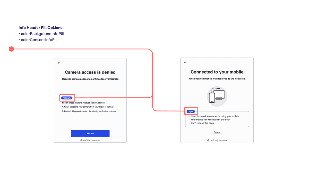 The screenshot above offers an illustration of the header and highlight customizations available for Web.
Cross-device
colorBackgroundQRCode: Change background color of the QR code on the Cross device screen
Typography and fonts
iOS
To customize typography in the iOS SDK, you can pass the required CSS values to the Appearance object, in the root of the WorkflowConfiguration object. For specific implementation details, please refer to our SDK reference documentation.
The iOS SDK supports the following typography features:
fontRegular: Defines the custom font name for the regular style labelsfontBold: Defines the custom font name for the bold style labels
Android
For the Android SDK, you can customize typography by providing font XML resources to the theme by setting OnfidoActivityTheme to one of the following:
onfidoFontFamilyTitleAttr: Defines the fontFamily attribute that is used for text which has typography type TitleonfidoFontFamilyBodyAttr: Defines the fontFamily attribute that is used for text which has typography type BodyonfidoFontFamilySubtitleAttr: Defines the fontFamily attribute that is used for text which has typography type SubtitleonfidoFontFamilyButtonAttr: Defines the fontFamily attribute that is applied to all primary and secondary buttonsonfidoFontFamilyToolbarTitleAttr: Defines the fontFamily attribute that is applied to the title and subtitle displayed inside the ToolbaronfidoFontFamilyDialogButtonAttr: Defines the fontFamily attribute that is applied to the buttons inside AlertDialog and BottomSheetDialog
Web
To customize the Web SDK typography, you can pass the corresponding CSS values to the customUI object.
customUI {Object}optional
For specific implementation details, please refer to our SDK reference documentation.
The Web SDK supports the following typography features:
fontFamilyTitle: Change font family of the SDK screen titlesfontFamilySubtitle: Change font family of the SDK screen subtitlesfontFamilyBody: Change font family of the SDK screen contentfontSizeTitle: Change font size of the SDK screen titlesfontSizeSubtitle: Change font size of the SDK screen subtitlesfontWeightTitle: Change font weight of the SDK screen titles (number format only, e.g. 400, 600)fontWeightSubtitle: Change font weight of the SDK screen subtitles (number format only, e.g. 400, 600)fontWeightBody: Change font weight of the SDK screen content (number format only, e.g. 400, 600)
Note: If you're using a scalable font size unit like em/rem, the SDK's base font size is 16px. This is currently not customizable.
Google Font
googleFonts: Load Google Font(s) into the SDK
The following fonts are available:
- Arimo
- Fira Sans
- Inter
- Kanit
- Lato
- Lexend
- Lora
- Merriweather
- Neuton
- Noto Sans
- Noto Sans Osmanya
- Nunito
- Nunito Sans
- Open Sans
- Oswald
- Overpass
- Playfair Display
- Poppins
- PT Sans
- Questrial
- Source Sans 3
- Raleway
- Red Hat Display
- Roboto
- Roboto Condensed
- Roboto Mono
- Roboto Slab
- Rubik
- Single Day
- Ubuntu
- Wix Madefor Text
- Work Sans
To request support for additional fonts, please reach out to your Customer Support Manager or email Onfido Support*
customUI: {
  "googleFonts": ["Overpass"],
  "fontFamilyTitle": "'Overpass', sans-serif",
}
*The fonts are hosted by Onfido and won't be loaded from Google's servers.
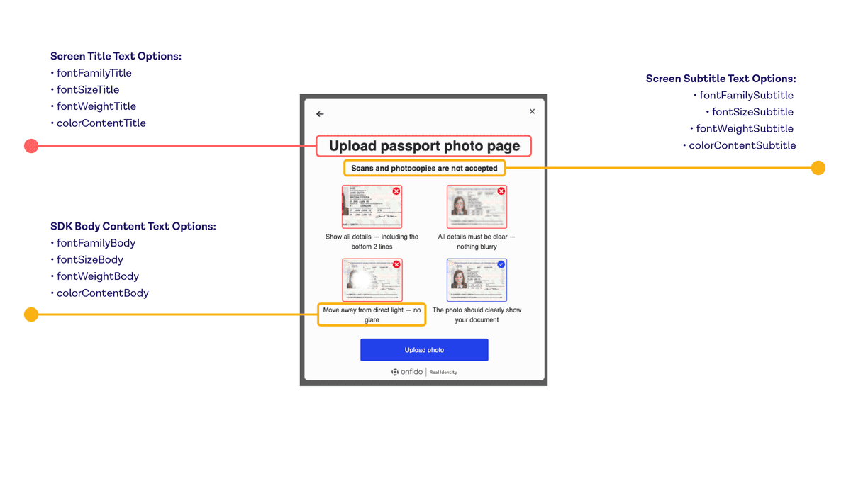 The screenshot above offers an illustration of the typography customizations available for Web.
Dark mode
Onfido's iOS and Android SDKs support dark mode customization. By default, the user's active device theme will be automatically applied to the SDK flow. However, you can opt out from dynamic theme switching at run time and set a theme statically at build time. In this case, the flow will always be in displayed in the selected theme regardless of the user's device setting.
iOS
The interfaceStyle attribute in the iOS SDK allows you to force light or dark mode via .dark and .light respectively, or follow the system's interface style with .unspecified. The value is .unspecified by default.
Note:
The previous attribute supportDarkMode is now deprecated. Please use interfaceStyle instead.
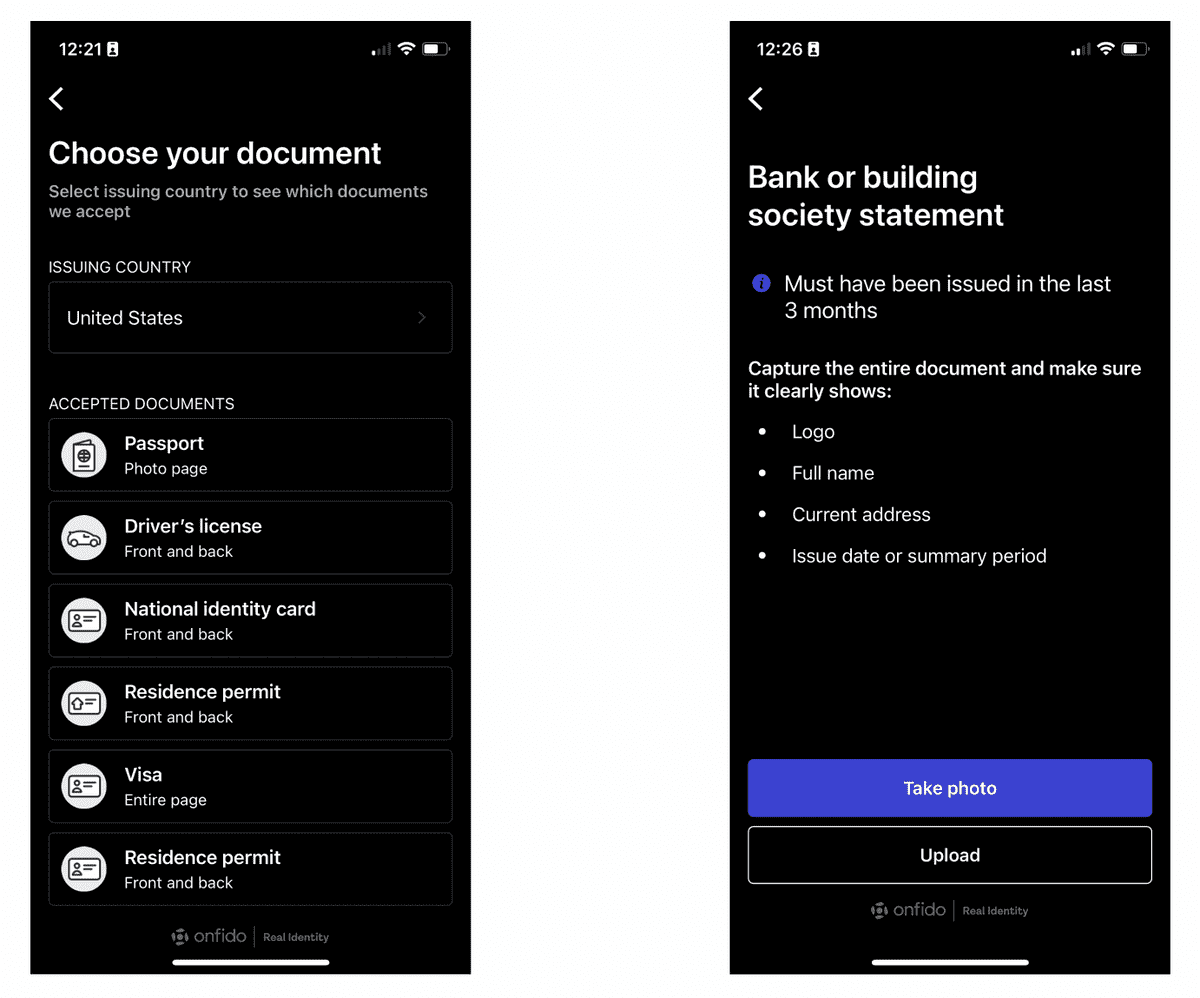 The example selection screens above illustrate dark mode for iOS.
For specific implementation details, please refer to our SDK reference documentation.
Android
Dark mode is available for the Android SDK starting from version 19.1.0.
To force select dark theme:
onfidoConfigBuilder.withTheme(OnfidoTheme.DARK)
To force select light theme:
onfidoConfigBuilder.withTheme(OnfidoTheme.LIGHT)
You can also automatically use the user's device theme:
onfidoConfigBuilder.withTheme(OnfidoTheme.AUTOMATIC)
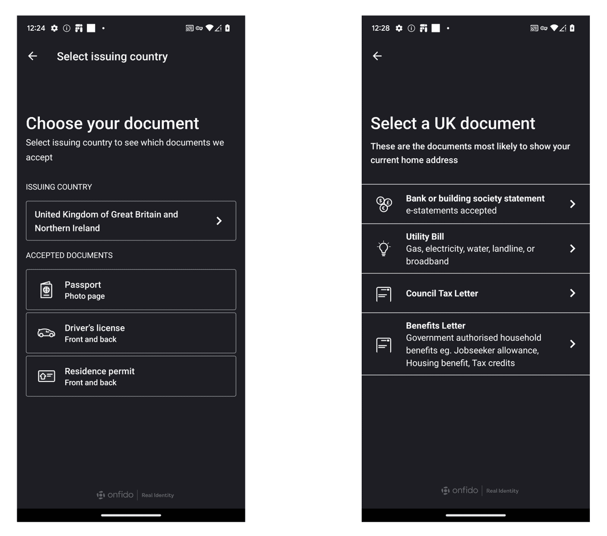 The example selection screens above illustrate dark mode for Android.
React Native
The React Native SDK supports the customization of colors and other appearance attributes used in the SDK flow on iOS and Android.
iOS
You can customize the SDK for iOS by adding a colors.json file to your Xcode project as a bundle resource. The file should contain a single json object with the desired keys and values.
The React Native SDK for iOS supports the following styling features:
onfidoPrimaryColor: Background color of views such as capture confirmation buttons, back navigation button, and play and pause buttons in liveness/video capture introbackgroundColor: Background color used for all non-capture views. Can be defined for both light and dark modeonfidoPrimaryButtonTextColor: Text color of labels included in views such as capture confirmation buttonsonfidoPrimaryButtonColorPressed: Defines the background color of capture confirmation buttons when pressedinterfaceStyle: Defines the supported interface styles ("unspecified" by default, which follows the sytem's interface style)secondaryTitleColor: Secondary button text and border colorsecondaryBackgroundPressedColor: Secondary button pressed state colorbuttonCornerRadius: Border corner radius for all buttons (default value is 5.0)fontFamilyTitle: Name of the font used for title textsfontFamilyBody: Name of the font used for body/content texts
For specific implementation details, please refer to our SDK reference documentation.
Dark mode
The React Native SDK for iOS supports dark mode customization.
The interfaceStyle property in the colors.json file allows you to force light or dark mode via dark and light respectively, or follow the system's interface style with unspecified.
Note: The usage of onfidoIosSupportDarkMode in the color.json is now deprecated. Please use interfaceStyle instead.
Android
You can customize the SDK for Android by overriding Onfido themes in your themes.xml or styles.xml files.
For specific implementation details, please refer to our SDK reference documentation.
The React Native SDK for Android supports the following styling features:
onfidoColorToolbarBackground: Background color of theToolbarwhich guides the user through the flowcolorPrimaryDark: Color of the status bar (with system icons) above theToolbaronfidoColorContentToolbarTitle: Color of theToolbar's title textonfidoColorContentMain: Color of primary texts on screen, e.g. titles and regular body textsonfidoColorContentSecondary: Color of secondary texts on screen, e.g. subtitlesonfidoColorContentNegative: Color of error textsonfidoColorActionMain: Background color of primary buttonsonfidoColorActionMainPressed: Background color of primary buttons when pressedonfidoColorActionMainDisabled: Background color of primary buttons when disabledonfidoColorContentOnAction: Text color of primary buttonsonfidoColorContentOnActionDisabled: Text color of primary buttons when disabledonfidoColorActionSecondary: Background color of secondary buttonsonfidoColorActionSecondaryPressed: Background color of secondary buttons when pressedonfidoColorActionSecondaryDisabled: Background color of secondary buttons when disabledonfidoColorContentOnActionSecondary: Text color of secondary buttonsonfidoColorContentOnActionSecondaryDisabled: Text color of secondary buttons when disabledonfidoColorActionSecondaryBorder: Border of the secondary buttonsonfidoColorActionSecondaryBorderDisabled: Border of the secondary buttons when disabledonfidoColorProgressTrack: Track color of progress indicators (background color)onfidoColorProgressIndicator: Indicator color of progress indicators (foreground color)colorAccent: Defines alert dialogs' accent color, and text input fields' focused underline, cursor, and floating label coloronfidoColorWatermark: Color of the Onfido logo and co-brand logo in the footer of screensonfidoColorDisclaimerBackground: Background color of disclaimer boxesonfidoColorContentDisclaimer: Text color of disclaimer boxesonfidoColorIconDisclaimer: Icon color of disclaimer boxesonfidoColorIconStroke: Stroke color of iconsonfidoColorIconFill: Fill color of iconsonfidoColorIconBackground: Background color of iconsonfidoColorIconAccent: Background color of accented icons
Note: The usage of color.json and the updateColors command is now deprecated for Android. Please provide the theme attributes in your styles.xml or themes.xml.
The React Native SDK for Android also supports limited dimension customization, via the onfidoButtonCornerRadius attribute. For specific implementation details, please refer to our SDK reference documentation.
Dark mode
The React Native SDK for Android supports dark mode customization.
To set a static theme, use the theme parameter in the SDK initialization config. The value type should be OnfidoTheme. Valid values in OnfidoTheme are: AUTOMATIC (default value), LIGHT, DARK.
For specific implementation details, please refer to our SDK reference documentation.
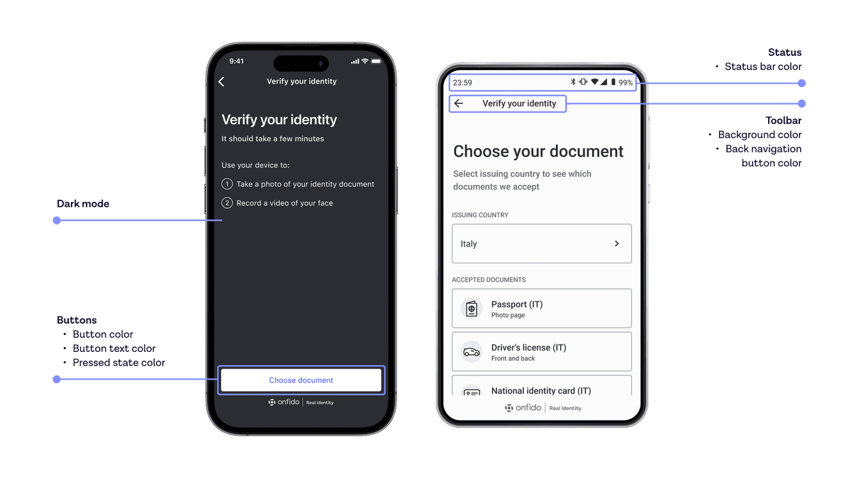 The screenshots above illustrate the customization options available for React Native
Flutter
The Flutter SDK supports the customization of colors and other appearance attributes used in the SDK flow on iOS and Android.
iOS
You can use the IOSAppearance object to customize the iOS application.
For specific implementation details, please refer to our SDK reference documentation.
The Flutter SDK for iOS supports the following styling features:
fontBold: Defines the custom font name for the bold style labelsfontRegular: Defines the custom font name for the regular style labelssecondaryTitleColor: Defines the secondary button text and border colorprimaryColor: Defines the button color and back navigation button colorbuttonCornerRadius: Border corner radius for all buttonsprimaryTitleColor: Defines the primary button text colorprimaryBackgroundPressedColor: Defines the primary button pressed state colorsecondaryBackgroundPressedColor: Defines the secondary button pressed state colorbackgroundColor: Defines the screen's background color for non-capture views
Dark mode
The Flutter SDK for iOS supports dark mode customization.
The onfidoTheme property in the IOSAppearance object allows you to force light or dark mode via DARK and LIGHT respectively, or follow the system's interface style with AUTOMATIC (the default value).
Note:: The usage of supportDarkMode in IOSAppearance is now deprecated. Please use onfidoTheme instead.
Android
Customization for Android (including dark mode) in the Flutter SDK is implemented in the the same way as native Android.
Please refer to the applicable Android documentation in this guide, as well as the Android SDK reference.
Smart Capture Link theme customization
The look and feel of identity verification flows hosted using Smart Capture Link - our low- to no-code frontend solution complementing Onfido Studio - can be customized in your Dashboard.
Details regarding the customization options available can be found in our Smart Capture Link guide.